Below are five exclusive, design-driven insights that move beyond trends and into the realm of lasting sophistication—ideas you can bring to your designer or tile installer to elevate every surface from expected to composed.
1. Treat Grout as a Design Material, Not a Afterthought
Grout is often chosen last and fastest—yet it is the element that visually binds or separates each tile. When treated deliberately, grout becomes a design material in its own right.
Consider three primary approaches. A tonal grout, closely matched to the tile, creates a monolithic, gallery-like surface that feels calm and expansive. A gently contrasting grout—one to two shades lighter or darker—defines the module without creating visual noise, ideal for spaces where you want depth but not pattern overload. A high-contrast grout, used sparingly and with intent, draws graphic lines that can echo architectural geometries or reinforce a room’s underlying grid.
Refined projects often play with grout width as much as color. Narrow joints on large-format tiles yield a seamless, stone-like plane, while slightly wider joints on smaller tiles can introduce a tailored textile effect. For truly premium results, align the grout color palette with adjacent materials: coordinate with metal finishes, stone veining, or cabinet tones so the entire composition feels orchestrated rather than assembled.
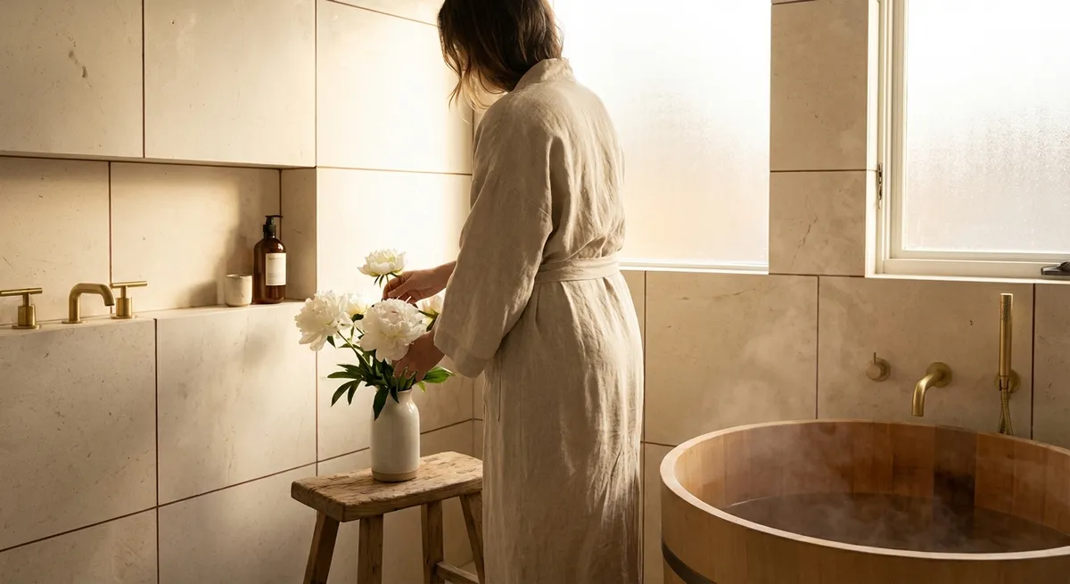
2. Compose Transitions as Moments, Not Edges
The most sophisticated tile work is often revealed not in the feature wall, but at the thresholds—the way tile meets wood, stone, carpet, or plaster. These junctions can feel abrupt and utilitarian, or intentional and crafted.
Instead of relying solely on standard reducer strips, consider flush transitions where finished tile height and adjacent flooring are meticulously planned from the subfloor up. This yields a continuous plane ideal for open-plan living, making the architecture feel more coherent and custom. A slim metal profile, chosen in a finish that echoes door hardware or plumbing, can turn an otherwise invisible joint into a subtle detail of precision.
Wall transitions matter just as much. Where tile stops in a bathroom or kitchen, aim for deliberate terminations aligned with architectural features—door heads, window casings, or a consistent datum line that wraps the room. This sense of “where the tile begins and ends” feels curated, not random. In shower niches and external corners, mitred edges or finely chosen trims prevent visual bulk and highlight the geometry of the space.
3. Layer Sheen and Texture for Understated Dimension
In refined interiors, light is treated like a material. Tile’s finish—matte, satin, or gloss—determines how that light behaves, and mixing these sheens within a cohesive palette creates a nuanced, layered environment.
Matte tiles absorb and soften light, ideal for creating spa-like calm in bathrooms or understated elegance in entryways. Highly polished surfaces bounce light and can amplify views and architecture, but they are most effective when used in measured doses or in areas where you want a sharper, more formal character. The sophisticated move is to combine them: a matte field tile with a subtle glossy accent stripe, or a wall clad in satin-finish tiles punctuated by a vertical band of relief tiles that catch light throughout the day.
Texture—whether structured, ribbed, or gently undulating—adds another layer of quiet richness. On a single-color wall, a change in tile texture can delineate functional zones (for example, behind a vanity) without needing a different hue. This approach keeps the palette edited while still providing depth. Be mindful of where light sources fall: wall sconces, concealed LED strips, and natural light from windows will emphasize texture differently, turning the room into a dynamic canvas that evolves from morning to evening.
4. Curate Scale and Pattern to Echo the Architecture
The most compelling tile designs feel integrated with the bones of the home. Instead of selecting tile solely for its individual beauty, consider how its scale and pattern can reinforce your architecture.
Large-format tiles can visually expand a compact space when their layout echoes the room’s primary lines. Run floor tiles lengthwise along a narrow bathroom to elongate it, or align tile joints with major architectural elements—like island ends, window centers, or doorway thresholds—to create a sense of ordered calm. In more traditional or detailed homes, smaller-format tiles, mosaics, or classic patterns (herringbone, basketweave, checkerboard) can harmonize with existing millwork and proportions.
A sophisticated touch is to vary scale, not color, across connected spaces. For instance, use a large-format tile in a main bathroom, then transition to a smaller mosaic of the same tone within the shower floor or niche. This continuity of hue with shifts in scale feels bespoke and intentional. Pay attention to pattern directionality: a herringbone or chevron layout can subtly guide movement toward a focal point—such as a freestanding tub, fireplace, or window—without the need for louder decorative gestures.
5. Design with Longevity: Classic Palettes, Modern Details
Truly elevated tile work ages well. While bold colors and hyper-specific patterns have their place, a premium approach often relies on a restrained, timeless palette paired with contemporary detailing.
Think of your tile as the architectural wardrobe staples of your home—stone-inspired neutrals, soft whites, charcoals, and muted colors that echo nature. These hues provide a calm backdrop capable of accommodating evolving furnishings, art, and textiles over time. The design interest then emerges through layout, joint alignment, edge treatments, and integration with lighting rather than through short-lived trends.
Investing in higher-quality tile and proper installation is part of this longevity mindset. Denser, well-fired ceramic or porcelain, or carefully selected natural stone, not only performs better but also feels different underfoot and to the touch. Pair that with modern details—concealed linear drains, precisely cut tile returns in window jambs, integrated tiled benches or plinths—and the space reads as quietly luxurious rather than merely new.
When making final selections, evaluate samples at home, in your actual light, and next to permanent materials like cabinetry and countertops. A refined palette is less about the single perfect tile and more about how the entire ensemble—tone, sheen, scale, grout, and adjacent finishes—coheres into one continuous narrative.
Conclusion
Exceptional tile design is not defined by spectacle, but by the intelligence of its decisions. Grout selection, transitions, sheen, scale, and long-term thinking may appear subtle in isolation, yet together they distinguish a simply “renovated” home from one that feels artfully composed. When you approach tile as a foundational design language—rather than a decorative afterthought—you create rooms that are not only visually compelling, but also poised to age gracefully with you.
These five insights offer a framework for deeper conversations with your designer, architect, or tile professional, ensuring that every tiled surface in your home reflects both discernment and enduring character.
Sources
- [Porcelain Tile Selection Guide – The Tile Council of North America](https://www.tcnatile.com/faqs/163-porcelain-tile.html) - Technical overview of porcelain tile characteristics and performance considerations
- [Ceramic Tile vs. Other Materials – U.S. General Services Administration](https://www.gsa.gov/real-estate/design-construction/engineering/ceramic-and-quarry-tile-flooring) - Government guidance on tile flooring, durability, and lifecycle aspects
- [Lighting and Interior Surfaces – U.S. Department of Energy](https://www.energy.gov/energysaver/lighting-choices-save-you-money) - Explains how different surfaces and finishes interact with light in interior environments
- [Historic Tile Patterns and Proportions – The Metropolitan Museum of Art](https://www.metmuseum.org/toah/hd/istr/hd_istr.htm) - Context on traditional tiling, pattern, and proportion from an art-historical perspective
- [Home Renovation and Material Choices – Harvard Joint Center for Housing Studies](https://www.jchs.harvard.edu/research-areas/remodeling) - Research on remodeling trends and the importance of durable, long-lasting materials