For homeowners seeking more than trend-driven finishes, tile is an extraordinary medium for subtle experimentation. The following design ideas explore five exclusive insights—less about following fashion, more about composing enduring spaces with a connoisseur’s eye.
1. Treat Tile as Architectural Tailoring, Not Decoration
Exceptional tile design begins by thinking like a tailor rather than a painter. Instead of simply “covering” a surface, imagine you are fitting the room with a bespoke suit.
Observe how walls meet ceilings, how floors meet thresholds, how cabinetry meets backsplash. Subtle decisions—where a pattern starts and stops, how a grout line aligns with a window mullion, how a niche aligns with a vanity edge—create a measured, architectural rhythm.
Before choosing color or pattern, trace the main sightlines of the room: the path from the entry, the view from a favorite chair, the perspective when the door is left ajar. Then, plan tile layouts to reinforce these axes. A rectified porcelain plank, for instance, might run parallel to the longest wall to visually extend the space, while a large-format stone-look tile centered on a focal window creates symmetry that feels quietly luxurious.
When tile is placed in thoughtful alignment with the room’s geometry, it reads as integral to the architecture, not as an afterthought. The result feels composed, not merely decorated.
2. Design with Light, Not Just Color
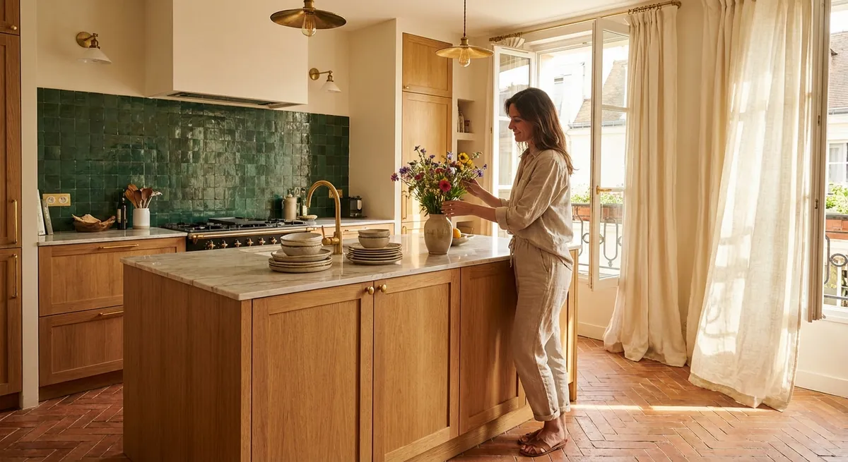
The most sophisticated tile schemes are orchestrations of light as much as hue. Gloss, semi-polish, and matte finishes each perform differently depending on the direction and quality of light in the room—and this performance should guide your selections.
In spaces with generous natural light, a subtle glazed tile with a soft undulation can create a watercolor effect on the wall, where highlights and shadows shift throughout the day. In a dim powder room or north-facing kitchen, too much gloss can appear cold or overly reflective; a satin or honed finish often delivers a refined, gallery-like calm.
Consider light layering: downlights grazing a textured tile create delicate shadow play, while wall sconces flanking a tiled vanity can soften a high-contrast pattern. Reflectance value matters, too. Lighter, softly reflective tiles expand the perceived volume of tight spaces, while velvety, low-sheen surfaces in deeper tones can make a large room feel intimate and tailored.
By sampling tiles on-site—both vertical and horizontal surfaces—you can observe how they behave under daylight and evening lighting. This approach transforms your tile choices from a flat color decision into a nuanced study of light, depth, and mood.
3. Compose “Micro-Galleries” with Restricted Palettes
Rather than scattering multiple tile styles throughout the home, create a few highly curated “micro-galleries”—small, composed areas where tile artistry is allowed to speak clearly. Think of these as curated vignettes: a shower wall, a fireplace surround, a mudroom bench, or a butler’s pantry backsplash.
The key is restraint. Choose one tile with a distinctive personality—perhaps a hand-crafted zellige, a stone mosaic with intricate veining, or a geometric pattern—and then frame it with quieter companions. For example, a dramatic marble mosaic in a shower niche becomes more elevated when the surrounding walls are clad in a calm, large-format porcelain that subtly echoes the stone’s undertone.
Limiting the palette to two or three complementary tiles throughout the home fosters a sense of continuity. You might repeat the same stone-look porcelain on floors across rooms, then “zoom in” to finer mosaics of the same material in key zones. This creates a layered cohesion: the house feels curated rather than collected.
These micro-galleries invite appreciation without overwhelming the senses. Each becomes a destination—an intentional moment of tile artistry within an otherwise serene backdrop.
4. Use Pattern and Scale to Quietly Sculpt Space
Sophisticated tile work often relies less on bold color and more on scale and pattern to shape how a room is experienced. Small adjustments in size and layout can subtly influence how spacious, intimate, or grounded a space feels.
In long, narrow rooms, a herringbone or chevron pattern running across the width can visually broaden the space, breaking the “bowling alley” effect. In contrast, running planks or linear tiles along the length emphasizes directionality and flow. Oversized tiles with minimal grout lines on floors create a calm, monolithic base—particularly luxurious in open-plan interiors.
On walls, consider how pattern density affects perception. A small-format mosaic from floor to ceiling can become visually intense; but introducing a dado line, a wainscot height, or a framed inset of pattern within a field of larger tiles brings balance. Think of these transitions like changes in tempo within a piece of music: they prevent monotony while preserving harmony.
Importantly, pattern scale should respect the room’s proportions. In a compact bath, one dramatic large-format tile used thoughtfully can feel more refined than a busy mix of small mosaics. In a generous primary suite, alternating tile sizes—say, a large floor tile and a medium wall tile in the same collection—adds sophistication without visual clutter.
5. Elevate Transitions into Deliberate Design Moments
The most telling mark of premium tile work is often found at the edges—where tile meets other materials, where one pattern yields to another, and where rooms shift in function. These transitions, when designed intentionally, become quiet signatures of quality.
Instead of abrupt changes in tile or flooring, explore graceful stepping stones between materials. A border of elongated subway tiles can mediate between a patterned encaustic floor and a calmer hallway tile. A slender marble threshold, perfectly aligned with grout joints, can elegantly resolve a change in level or room function.
Vertical transitions deserve equal attention. Consider capping a tiled wainscot with a slim stone or bullnose detail that echoes the countertop material. Where tile stops mid-wall, align that termination with an architectural element—window trim, door height, or shelving line—so the edge feels inevitable rather than arbitrary.
Grout color is another powerful tool: matching grout across two adjacent tiles of different formats can visually unify them; introducing a slightly deeper grout at thresholds can subtly reinforce a sense of passage from one zone to another.
When transitions are studied rather than improvised, the home feels meticulously tailored. The guest may not articulate why, but they will sense that every surface has been considered.
Conclusion
Refined tile design is less about dramatic gestures and more about intelligent nuance. When you treat tile as architectural tailoring, choreograph it with light, curate focused “micro-galleries,” sculpt space through pattern and scale, and choreograph transitions with precision, tile becomes a language of quiet luxury in your home.
These ideas are not about following a fleeting style; they are about cultivating a discerning eye—one that sees each tile, grout line, and edge detail as part of a larger composition. In the hands of a thoughtful homeowner and a skilled installer, tile can transform from simple surface to enduring, artful architecture underfoot and overhead.
Sources
- [Porcelain Enamel Institute (PEI) – Tile Selection Guidelines](https://www.porcelaininstitute.org) – Offers technical background on tile durability, finishes, and appropriate applications for different spaces
- [American National Standards Institute (ANSI) – Tile Installation Standards via TCNA](https://www.tcnatile.com/technical.html) – Outlines best practices for layout, transitions, and installation quality that support refined design outcomes
- [Cersaie – International Exhibition of Ceramic Tile and Bathroom Furnishings](https://www.cersaie.it/en/index.php) – Showcases global trends, design-forward uses of scale, pattern, and finishes in tile
- [Houzz – Design Research on Kitchen and Bathroom Trends](https://www.houzz.com/research) – Provides homeowner survey data and case studies illustrating how tile is used in contemporary, high-end residential design
- [The New York School of Interior Design – Interior Design Resources](https://www.nysid.edu/resources) – Offers educational materials on light, proportion, and materiality that inform sophisticated tile composition and spatial planning