Designing the Room Around a Single “Quiet Hero” Tile
Sophisticated rooms rarely compete for attention; they revolve around one decisive gesture. Instead of building a scheme from multiple statement materials, consider anchoring the space with a single “quiet hero” tile—a surface that carries the room through its restraint, not its volume.
This tile might be a honed limestone-look porcelain with a soft, chalky presence underfoot, or a deeply pigmented, matte square that reads like velvet in low light. Once this principal tile is chosen, every other element—paint, fixtures, soft furnishings—should be selected to serve it. Metals are tuned to its undertones, grout is matched for seamlessness or gentle contrast, and joinery is simplified so the eye reads broad planes of calm, uninterrupted surface.
By letting one tile speak and everything else listen, you avoid the patchwork effect that often plagues even expensive renovations. The result feels curated rather than coordinated: a room that seems to have been designed in a single, confident gesture.
Composing With Scale: Large Formats, Small Details
One of the most refined ways to work with tile is to treat scale as your primary design tool. Large-format porcelains—think 24" x 48" and beyond—create expansive, gallery-like planes that visually declutter a room, especially on floors and shower walls. Fewer grout lines mean less visual interruption, allowing the architecture to breathe.
Yet within these generous spans, a sophisticated scheme is often defined by a counterpoint of smaller details. A niche lined in trim-like mosaics, a narrow pencil border outlining a tub deck, or a subtly inset strip of smaller-format tile under a vanity can all introduce precision without breaking the overall calm.
This interplay of macro and micro scale works particularly well in open-plan spaces, where floors need to read as serene and continuous, while functional zones—entry thresholds, kitchen work areas, or hearth surrounds—are gently indicated by a shift in pattern or piece size. When scale is carefully orchestrated, tile stops being simply “on” the room and begins to shape how the room is perceived and used.
Elevating Grout From Background to Design Instrument
In refined tile work, grout is never an afterthought; it is a design instrument with both visual and functional weight. Slight adjustments in tone, joint width, and finish can dramatically alter how expensive and resolved a surface appears.
A tone-on-tone grout (one or two shades off the tile color) will visually “melt” joints, especially with rectified porcelain, producing a nearly slab-like effect that reads as contemporary and tailored. In contrast, a controlled, soft contrast—say, a warm grey with a cream tile—can lightly outline each piece, emphasizing pattern without venturing into graphic busyness.
The joint width itself is equally critical. Narrow joints convey precision and modernity, suited to architecturally clean spaces, while slightly wider joints can soften traditional or rustic schemes and accommodate handmade or zellige-style tiles with charming irregularities. Specifying high-performance grout with stain resistance and a refined, matte finish ensures that the surface ages gracefully, supporting the overall sense of enduring quality.
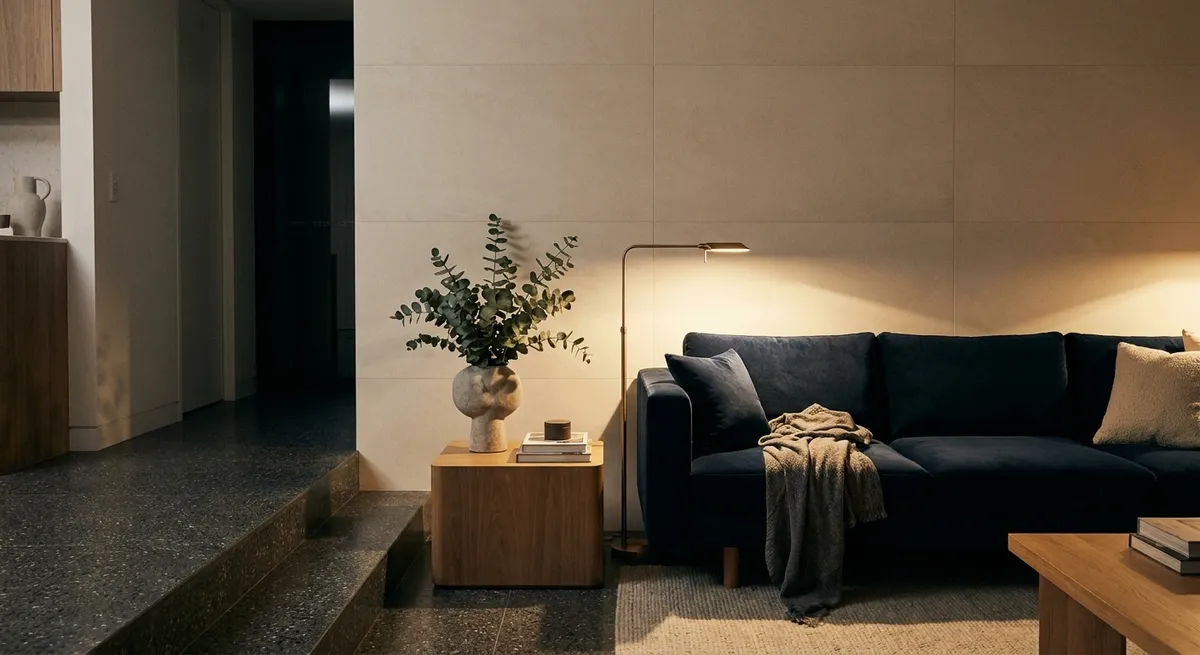
Playing With Light: Finish, Texture, and the Room’s Atmosphere
Tile interacts with light in ways paint and wood simply cannot. A sophisticated scheme leverages this, pairing finishes and textures to sculpt the room’s atmosphere from morning to evening.
Matte and honed finishes absorb light, lending a soft, velvety calm ideal for large surfaces like floors or expansive walls. They minimize glare and feel inherently more architectural. Opposite them, carefully placed glossy or subtly glazed tiles can be used almost like jewelry: behind a vanity mirror, inside a shower niche, or along a kitchen backsplash where they catch under-cabinet lighting and candlelight.
Relief textures and gentle fluting transform ordinary walls into tactile backdrops that shift character as daylight moves across them, especially in entryways and dining rooms. These surfaces are not about spectacle; they reward proximity. When lighting is layered—ambient, task, and accent—the tile quietly choreographs how the space feels at different times of day, imbuing even small rooms with unexpected depth.
Extending Tile Beyond the Expected: Architectural Continuity
Perhaps the most luxurious use of tile is when it is allowed to behave like architecture rather than ornament. Extending surfaces beyond the strictly functional zones creates a sense of continuity and deliberateness that distinguishes bespoke spaces from standard renovations.
A floor tile that runs uninterrupted from entry to kitchen to terrace visually lengthens the home and dissolves boundaries between inside and out—particularly effective with outdoor-rated porcelain in stone tones. A bath clad in the same tile from floor to wall, continued behind a freestanding tub and up into a window reveal, becomes an enveloping retreat rather than a collection of fixtures.
Even subtle moves—wrapping a fireplace surround onto the adjacent wall, tiling a window seat that visually connects to the floor, or lining a powder room ceiling in the same small-format tile as the walls—signal that tile was integrated into the architecture from the outset. This is the language of custom work: the feeling that the surfaces and the structure were conceived as one coherent idea.
Conclusion
Truly elevated tile design is less about spectacle and more about insistence on quiet precision. When you choose a single “hero” surface, choreograph scale with intention, treat grout as a design decision, sculpt light through finish and texture, and extend tile beyond its predictable boundaries, you transform rooms from merely finished to finely resolved. The result is a home that feels both current and enduring—where every tiled surface contributes not just to durability, but to an atmosphere of considered, lasting elegance.
Sources
- [Porcelain Tile Use and Design Considerations – TCNA Handbook](https://www.tcnatile.com/technical-services/hna.html) - Technical guidance on tile selection, formats, and performance from the Tile Council of North America
- [Marazzi USA – Large Format Tile Design Inspiration](https://www.marazziusa.com/inspiration/trends/large-format-tile) - Visual examples and practical notes on using large-format tiles for cohesive interiors
- [Crossville Inc. – Grout and Joint Size Recommendations](https://www.crossvilleinc.com/resources/technical-information/faq) - Manufacturer insights on grout color, joint sizing, and their impact on finished aesthetics
- [Porcelanosa – Texture and Relief Tile Collections](https://www.porcelanosa.com/en/tile/) - Reference for how textured and relief tiles influence light, depth, and architectural character
- [U.S. Department of Energy – Residential Lighting Design Basics](https://www.energy.gov/energysaver/lighting-choices-save-you-money) - Explains how different lighting types interact with surfaces, informing finish and texture choices for tile