Below, you’ll find five exclusive, often-overlooked insights that elevate tile from a background finish to a quietly commanding presence in the home.
The Art of Alignment: Designing Sightlines Before Layout
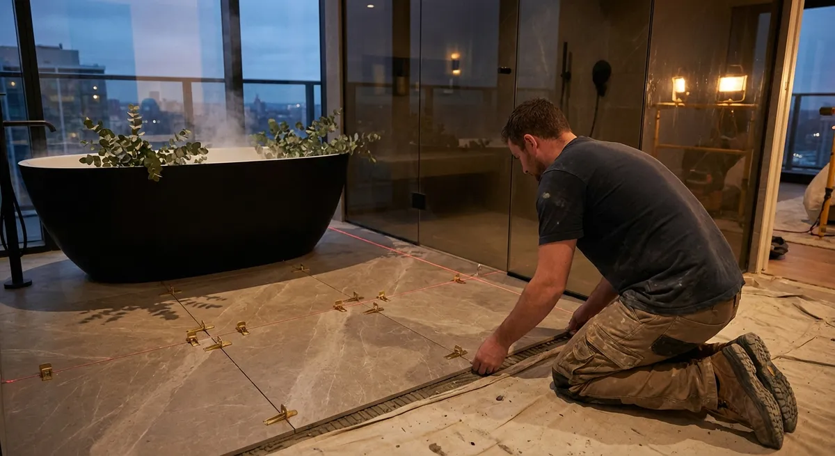
Most tile installations begin with a room’s perimeter. The finest ones begin with its sightlines. Before a single tile is set, a meticulous installer will stand at each threshold and key vantage point, mapping where the eye naturally travels. This determines which lines must be flawless and which can discreetly absorb cuts or transitions.
In a corridor, large-format tiles should align precisely with door casings or the axis of the hallway, not simply with the nearest wall. In a bathroom, grout joints should run symmetrically through the centerline of the vanity, mirror, and shower opening wherever possible. In open-plan spaces, flooring tile can be used to subtly “anchor” furniture groupings by aligning grout joints with the edges of islands, consoles, and dining tables.
This approach often requires intentionally shifting the pattern away from perfectly equal cuts at each wall in favor of a more elegant visual narrative. It may mean accepting a concealed narrow cut behind a freestanding tub to preserve unbroken tile faces where they matter most. True luxury is in what you notice subconsciously: doors that feel centered, rooms that feel balanced, and transitions that feel inevitable rather than improvised.
Quiet Grout Decisions: Chromatic Nuance as a Design Tool
Homeowners tend to agonize over tile selection and then treat grout as an afterthought. In high-end installations, grout is treated as a chromatic instrument with its own design logic. The right grout shade can either underscore geometry or dissolve it, depending on the desired effect.
For veined stone or stone-look porcelain, a slightly softened grout tone—one that picks up a secondary color from the veining—creates a composed, almost monolithic surface. For hand-crafted or zellige-style tiles, a marginally contrasting grout brings out the irregularities and celebrates the artisan character without feeling busy. With mosaics, especially on shower floors, a gently mid-tone grout often performs best, both visually and functionally, minimizing the appearance of wear while retaining clarity of pattern.
Equally important is grout joint width. A 1/16-inch joint with rectified porcelain suggests tailored precision, particularly on walls or in more architectural spaces. On the other hand, a slightly wider joint can feel warmer and more traditional in kitchens and mudrooms, where the goal is a cultivated ease rather than gallery-like severity. The world’s most sophisticated tiled spaces rarely shout “tile and grout.” They read as coherent fields of tone, texture, and shadow.
The Substrate as Signature: Invisible Preparation, Visible Refinement
What lies beneath the tile is rarely photographed, but its quality is written into every finished surface. Premium installers treat substrates—backer boards, membranes, and underlayments—as carefully as a cabinetmaker treats joinery. This is where flatness, longevity, and quiet refinement are engineered.
High-performance backer boards and uncoupling membranes can prevent cracking and movement, especially in homes with radiant heating or spanning older subfloors. Self-leveling underlayments are used not only to correct irregularities but to achieve a degree of planar perfection that allows large-format tiles to sit without lippage, that subtle but unsightly step between edges. On walls, especially in showers, tight tolerances for plumb and square ensure that niches, benches, and edges read as crisp architectural elements rather than approximate carpentry.
For the homeowner, the key is to ask not just “What tile will be used?” but “What is the build-up beneath it?” A proper waterproofing system in wet areas, correctly detailed transitions at thresholds, and thoughtful movement joints at perimeters are all part of a premium installation. They are invisible when done correctly—and painfully visible when neglected.
Edges, Terminations, and the Luxury of Restraint
Edges are where tile work reveals its true level of craft. High-end installations are defined by how they begin, pause, and end—not only by what happens in the center of the field. Every termination is an opportunity for a refined decision.
In showers and around niches, carefully mitred corners or precise use of color-matched trims can eliminate the visual clutter of exposed metal edges. When transitions to paint or wallpaper are necessary, a slim, minimal profile or an expertly aligned bullnose can create a quiet, shadowed reveal rather than a harsh boundary. At floor transitions, stepping down to hardwood or stone with a flush, beveled meeting point feels deliberate and custom, whereas generic metal strips often signal compromise.
Even stair risers and thresholds can be designed with a tailored sensibility: continuous bullnoses, aligned grout joints from tread to riser, and subtle overhangs that respect both scale and comfort. These minor decisions collectively determine whether your tile appears “installed” or “integrated”—and that difference is what makes a space feel truly resolved.
Pattern with Purpose: Curated Complexity, Not Decorated Chaos
Pattern in tile is most successful when it feels inevitable rather than decorative. For discerning homeowners, the question is rarely “How much pattern?” but “Where should pattern do the most work?” The answer is almost always: in framed, controlled moments.
A herringbone layout running the length of an entire ground floor can quickly become overwhelming. Limited instead to a foyer, a mudroom, or the inner frame of a shower wall, it becomes a gesture of intent—a subtle accent that carries architectural weight. Similarly, a bold marble vein bookmatched across a shower feature wall or behind a freestanding tub feels curated when the surrounding fields are calm and spare.
On floors, running bond or stacked layouts often serve elegantly as background, allowing fixtures, art, and natural light to remain primary. Under kitchen islands, a change in direction or module can quietly delineate functional zones without resorting to visible thresholds. The most successful patterned installations are premeditated: they are drawn, scaled, and aligned long before tile ever meets thinset. The result is a pattern language that supports the home rather than competes with it.
Conclusion
Exceptional tile work does not depend solely on expensive materials. It is the outcome of deliberate alignment, nuanced color decisions, disciplined preparation, immaculate terminations, and pattern used with intent. When homeowners understand these five deeper layers of tile installation, they can communicate with their installer in more precise, elevated terms—and insist on craftsmanship that matches the ambitions of their home.
In a world of quick installs and disposable finishes, investing in this level of thoughtfulness is a quiet luxury. The reward is not only surfaces that endure, but spaces that feel composed, calm, and unmistakably bespoke.
Sources
- [TCNA Handbook for Ceramic, Glass, and Stone Tile Installation](https://www.tcnatile.com/products-and-services/publications/handbook.html) - Industry-standard guidelines and best practices for tile installation and substrates
- [Schluter Systems – Technical Resources](https://www.schluter.com/schluter-us/en_US/technical-center) - Detailed information on membranes, edge profiles, waterproofing, and movement joints
- [Custom Building Products – Setting Materials & Preparation](https://www.custombuildingproducts.com/how-to/) - Guidance on surface preparation, thinset selection, and grout considerations
- [U.S. Department of Housing and Urban Development (HUD) – Residential Rehabilitation Guide](https://www.hud.gov/program_offices/healthy_homes/rrsm) - Broader context for proper substrate work and moisture management in residential construction
- [Tile Council of North America – Grout and Joint Size Recommendations](https://www.tcnatile.com/faqs/96-grout-joint-size.html) - Authoritative recommendations on grout joint sizing and its visual and functional implications