Designing Beyond the Sample: Reading the Tile Like a Material, Not a Product
Most tile decisions are made by holding a single sample under showroom lighting. Cultivated installations begin long before mortar touches substrate; they begin with understanding how the tile behaves as a field, not a fragment.
Consider how the tile will look en masse: variation, reflection, and scale become far more pronounced when repeated across a wall or floor. Stone-look porcelains, zellige-style tiles, and marbles each have movement and patterning that can either calm or agitate a space. Request at least one full box of your chosen tile on-site before committing to layout—spread the pieces out in natural light and examine variation, edge quality, and gloss. This is where you decide if you prefer a controlled, book-matched composition or a more organic tapestry.
Subtle but important questions emerge at this stage: Will the sheen emphasize or minimize surface irregularities? Does the rectification (precise cutting) allow for a minimal grout joint, or will you need a slightly wider line for a visually forgiving field? By treating tile as a material system rather than a decorative finish, you set the stage for a result that looks intentionally composed rather than merely installed.
Exclusive Insight 1: Curated Layouts—Planning the View, Not Just the Room
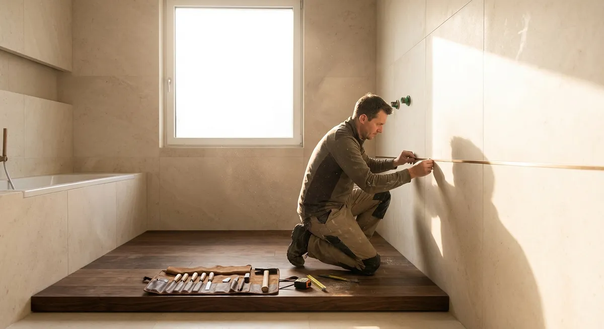
Typical installations start with a tape measure; elevated installations start with a vantage point. The most important surfaces are the ones you see first, not necessarily the largest.
Stand at key thresholds—entry to the bathroom, top of the stairs, primary suite door—and plan from those sightlines. In a shower, the back wall you see when the door opens should be treated almost as a feature wall, even if you use the same tile throughout. Center a pattern or large-format tile on that wall so the grout lines align symmetrically with the opening, then work outward to secondary walls, accepting smaller cuts where they are visually discreet.
On floors, decide whether the layout should be centered on the room, the doorway, the vanity, or another architectural element. A slightly off-center grout line that slices through the middle of a hallway can visually “tilt” an otherwise expensive space. Ask your installer to dry-lay a few rows or use chalk lines to visualize options before committing. This attention to visual hierarchy—prioritizing key views instead of pure geometry—introduces a level of sophistication that most tile layouts never achieve.
Exclusive Insight 2: Seamless Thresholds—Where Luxury Is Quietly Decided
The point where tile meets another material—wood, carpet, stone—is often where installations betray their quality. Luxurious environments never feel “patched together”; they feel continuous, even when materials change.
Plan transitions at architectural breaks: door centers, cased openings, or beneath pocket doors. When tile meets wood, aim for an aligned plane rather than a clumsy step; this may require subtle subfloor preparation so both materials sit at the same height. Consider minimal, elegant profiles in brushed stainless, brass, or color-matched metal only when necessary—used sparingly, they feel intentional rather than corrective.
Wet areas such as bathrooms demand both beauty and performance. If you prefer a curbless shower, it must be planned from day one: the subfloor needs to be recessed or carefully sloped, drains positioned with precision, and large-format tiles chosen for controlled drainage without awkward slivers. The transition from bathroom tile to adjacent bedroom flooring should feel like a soft punctuation mark, not a speed bump—achieved through thoughtful height coordination, grout color continuity, and crisp edging.
Exclusive Insight 3: Grout as a Design Instrument, Not a Necessary Evil
In refined tile work, grout is as intentional as paint color. It determines whether a surface reads as a serene monolith or a rhythmic grid. Thoughtful grout selection has more impact than most homeowners realize.
Tone-on-tone grout with stone or cement-look tiles creates a quiet, expansive surface that feels more architectural than decorative. High-contrast grout, by contrast, highlights geometry and can work beautifully in classic patterns like herringbone or basketweave, especially in smaller spaces where a hint of graphic structure is welcome. For natural stone or deeply textured tiles, a slightly softened contrast often works best—enough to define, not enough to dominate.
Performance also matters: epoxy or high-performance cementitious grouts offer superior stain resistance and color stability, particularly in kitchens, showers, and entryways. For large-format floors, slightly wider joints may be technically necessary due to tile tolerance, but clever grout color selection can visually minimize those lines. Treat grout as part of the palette, not an afterthought, and insist that your installer provide a grout sample board alongside the tile before proceeding.
Exclusive Insight 4: Elevation, Not Just Layout—The Vertical Story of Your Tile
Most homeowners think in floor plans; truly exceptional tile work is designed in elevation as well. The vertical story—how tile climbs walls, wraps corners, and terminates at ceilings—often determines whether a space feels custom or generic.
In bathrooms, decide whether tile will stop at a set height or rise to the ceiling. A full-height tile wall in the shower often feels more tailored, especially in rooms with higher ceilings where a halfway-line can appear arbitrary. Consider aligning the top edge of wall tile with key elements such as window heads, door frames, or cabinet tops to create a quiet visual order.
Corners and edges are especially revealing. Mitred edges (where two tile edges are cut at 45 degrees to form a sharp, solid-looking corner) are more labor-intensive but yield a highly refined look, particularly with stone and high-end porcelain. Where metal profiles are used, choose finishes that harmonize with plumbing and door hardware rather than defaulting to a generic silver trim. Vertical planning ensures that every wall, niche, and window reveal feels deliberate, not leftover.
Exclusive Insight 5: Light, Reflection, and the Subtle Drama of Finish
The relationship between light and tile finish separates merely attractive installations from exquisite ones. Gloss, satin, and matte tiles each react differently to both natural and artificial light, influencing the mood of a room from morning to evening.
Gloss tiles catch and bounce light, enhancing brightness but also magnifying irregularities in walls and substrates. They’re ideal for feature walls where controlled reflections can add depth—think a softly shimmering backsplash or a shower wall opposite a window. Matte or satin finishes are more forgiving and often more sophisticated for large expanses, particularly on floors where reduced glare creates a calmer, gallery-like atmosphere.
Directional lighting—recessed downlights, wall washers, or concealed LED strips—can either flatter or expose tile work. Grazing light (placed close to the wall) will accentuate texture but will also reveal any lippage (height differences between tiles). For perfectly flat, rectified installations, this can be a deliberate design move; for more forgiving surfaces, a softer, more diffuse lighting layout is often preferable. Collaborate with your lighting designer or electrician early so fixture placement supports, rather than sabotages, the subtleties of your tile.
Crafting a Space That Whispers, Not Shouts
Truly distinguished tile installation is not about ornament or spectacle; it is about the quiet convergence of planning, proportion, material, and light. When layouts prioritize sightlines rather than mere symmetry, when thresholds are seamless, when grout and finish are treated as part of the design language, the result is a space that feels effortlessly composed.
For homeowners who value discreet luxury, the most important decisions are made long before the first tile is set: insisting on full-box reviews, approving elevation drawings, questioning transitions, and understanding how light will interact with every surface. Partner with an installer who welcomes that level of dialogue and detail. The reward is an environment where the tile doesn’t simply decorate your home—it dignifies it.
Sources
- [Tile Council of North America (TCNA) Handbook](https://www.tcnatile.com/technical-information/handbook.html) - Industry reference for best practices in tile installation, including substrates, layouts, and performance standards
- [American National Standards Institute (ANSI A108/A118/A136.1)](https://webstore.ansi.org/standards/tca/tcaa108a118a1362019) - Technical standards governing professional tile installation methods and materials
- [Schluter Systems – Tile Edge Profiles & Transitions](https://www.schluter.com/schluter-us/en_US/Profiles/c/P) - Detailed guidance on elegant transition solutions and edge treatments between tile and adjacent materials
- [National Kitchen & Bath Association (NKBA) – Bathroom Planning Guidelines](https://nkba.org/info/resource-library/bathroom-planning-guidelines) - Recommendations for bathroom layouts, clearances, and wet-area planning that influence tile design and installation
- [University of Florida IFAS Extension – Slip Resistance and Flooring](https://edis.ifas.ufl.edu/publication/FE1033) - Research-based discussion of flooring safety, including considerations relevant to tile finish and surface selection