Below, we explore five exclusive, design-forward insights that help homeowners move beyond standard selections and into the realm of cultivated, tile-led spaces.
Designing the Room Around the Tile, Not the Tile Around the Room
Most projects treat tile as the final layer; the sophisticated approach treats tile as the starting brief. The most memorable spaces are often built around a singular, decisive surface—an encaustic floor, a honed limestone wall, or a quietly luminous field tile in an unusual proportion.
Begin by identifying one “hero” surface and allow other elements to recede in support. If your floor tile has a complex pattern or strong veining, keep millwork and textiles restrained so the room feels intentional rather than crowded. Conversely, a minimal tile—think matte white, elongated, with a fine grout line—can function as the visual silence that allows statement lighting, art, or hardware to take center stage.
When tile is elevated to the role of primary design driver, choices around cabinetry color, fixture finish, and even furniture silhouettes become more disciplined. The result is a space that feels unified from the ground up, rather than a collage of late-stage decisions.
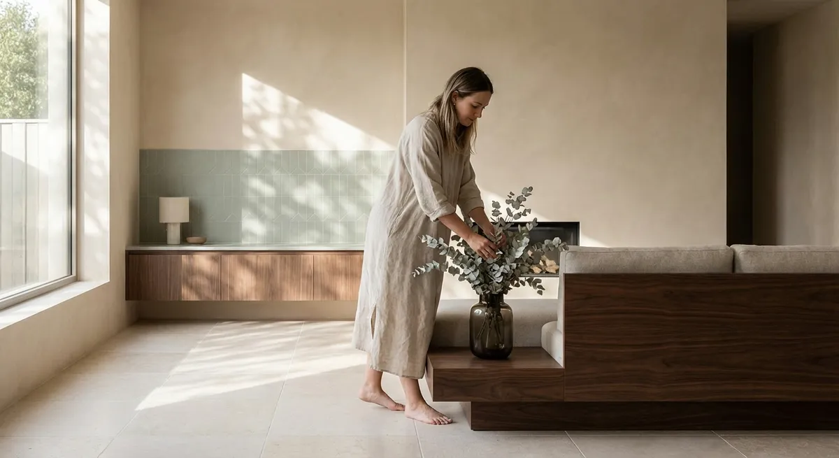
Working with Light: How Finish and Format Shape Atmosphere
Light is tile’s most powerful collaborator. The same color and pattern can read dramatically differently depending on finish, edge, and texture. Gloss tile amplifies light and reflections, lending a crisp, almost lacquered quality. In small or dim rooms—powder baths, inner hallways—this can create a jewel-box effect, but in bright spaces it may veer into glare. Matte and honed finishes, by contrast, soften light into a velvety wash that feels calm, grounded, and exceptionally modern.
Consider how daylight moves across your room before you commit. In north-facing spaces where light is cooler, warm-toned or subtly variegated tiles prevent the room from feeling clinical. In south-facing rooms awash with sun, a honed surface and tightly matched grout will prevent overactive visual noise. Format also matters: large-format tiles minimize grout lines and create a serene, continuous field—perfect for spa-like baths—while smaller modules catch light in miniature, adding delicacy to otherwise minimal schemes.
Thoughtful pairing of finish and format with existing light allows tile to behave like a dimmer switch for the entire room, adjusting mood and depth without touching the wiring.
Grout as Tailoring: The Art of Micro-Contrast
In considered homes, grout is rarely an afterthought. It is closer to fine tailoring: the slender line that can elongate, sharpen, or soften the entire silhouette. Slight shifts in contrast—just one or two tones away from the tile—can profoundly change the read of the surface without appearing loud.
Tone-on-tone grout (closely matched to the tile) produces a calm, monolithic plane that emphasizes material over pattern. This is ideal for high-end stone looks or large-format porcelain where the goal is continuity. A medium contrast—say, warm gray grout with a sand-colored tile—quietly articulates the grid, adding a structured rhythm that feels architectural, not busy. High contrast, like charcoal on white tile, pushes the geometry forward; it can be powerful in restrained doses (a backsplash, a niche, a small entry) but tends to overwhelm large areas in refined interiors.
Sophisticated spaces also play with grout texture and joint width. Narrow joints with a smooth, flush finish read sharp and contemporary. Slightly wider joints with a fine-sand texture can nod to traditional craftsmanship. Treat grout as you would a frame around a painting: subtle enough to support, precise enough to elevate.
Layering Tile Types for Depth Without Clutter
A truly elevated room often uses more than one tile—but never looks like a showroom. The distinction lies in controlled variation. Instead of mixing multiple bold patterns, combine tiles that share a common thread: a color family, a finish, or a stone species. This creates depth and nuance without visual chaos.
For instance, you might pair a honed marble-look porcelain floor with a smaller, tumbled mosaic of the same tone in the shower niche, plus a gently textured field tile on the walls. The eye registers difference, but the space still reads as a single composition. In kitchens, a restrained approach might involve a minimal floor tile combined with a subtly dimensional backsplash—think fluted or gently beveled tile in the same hue—so the surfaces speak quietly to each other.
This layered methodology works particularly well in open-plan spaces where tile must transition between zones. One tile might anchor the kitchen and another define a bar, pantry, or hearth area, both united by color temperature and finish. Skillful layering ensures each zone feels intentional while the whole remains cohesive and serene.
Using Edge Details and Transitions as Design Signatures
Edge treatments are where everyday tile work often reveals its limitations—and where exceptional work quietly distinguishes itself. Sophisticated interiors treat terminations, thresholds, and transitions as opportunities to express craftsmanship.
Consider schluter and trims as jewelry for your surfaces. A slim, color-matched edge creates a seamless, contemporary line; a brushed brass or stainless steel profile can introduce a subtle metallic accent that ties in with fixtures and hardware. In wet areas, a meticulously executed mitered corner on stone-look porcelain or large-format tile can emulate the language of solid stone, immediately elevating the room.
Floor transitions are equally critical. Instead of the default metal strip between tile and timber, explore recessed transition strips, flush details, or a deliberate “picture frame” border that defines zones. The aim is to make every edge feel resolved, never improvised. When these small decisions are handled with precision, the entire project feels more bespoke, even if the underlying materials are accessible.
Conclusion
Refined tile design is less about spectacle and more about orchestration—of light, proportion, finish, and detail. When you design the room around a considered surface, collaborate with natural light, treat grout as tailoring, layer related materials, and invest in thoughtful edge details, tile stops being a background material and becomes a defining element of your home’s character.
For homeowners seeking a quietly luxurious environment, these five insights offer a framework for working with designers and installers at a higher level. The outcome is not simply beautiful tile—it is a space that feels composed, enduring, and unmistakably intentional.
Sources
- [Porcelain Tile Selection Guide – The Tile Council of North America](https://www.tcnatile.com/faqs/92-porcelain-tile.html) – Technical background on porcelain tile performance, finishes, and classifications
- [Ceramic Tile, Thin-Set, and Grout Design Manual – American National Standards Institute (ANSI A108/A118/A136](https://webstore.ansi.org/standards/tcmna/ansia108a118a1361-2022) – Industry standards that inform best practices for grout, setting materials, and detailing
- [Natural Stone Institute – Stone Selection & Finishes](https://www.naturalstoneinstitute.org/consumers/stone-101/stone-finish/) – Detailed explanations of honed, polished, and textured finishes and their aesthetic impact
- [Harvard Graduate School of Design – “Light Matters: Material, Space, and Illumination”](https://www.gsd.harvard.edu) (search within site) – Architectural perspectives on how material surfaces interact with light in interior environments
- [National Kitchen & Bath Association (NKBA) Design Guidelines](https://nkba.org) – Professional guidelines on kitchen and bath planning, including surface coordination and material transitions