Below, we explore five exclusive, design-forward insights that elevate tile from specification to sensorial experience. Each idea is grounded in architectural thinking and crafted for those who expect their surfaces to feel as sophisticated as the furnishings they frame.
1. Designing with Light, Not Just Color
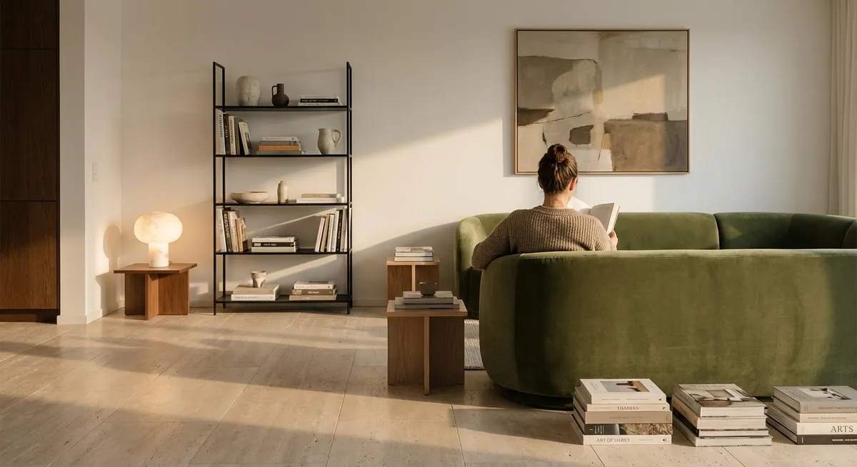
Most tile choices begin with color, yet the most refined spaces are composed with light in mind first. Consider how your surfaces will interact with both natural and artificial light across the day. A honed limestone-look porcelain on a sunlit floor will diffuse brightness into a soft wash, while a satin-glazed wall tile near a window can catch oblique light and render subtle micro-reflections that feel quietly luxurious rather than glossy and loud.
Think about the direction of light when choosing finish. In north-facing rooms that receive cooler illumination, warmer-toned tiles with a gentle sheen can counteract flatness. In bright, south-facing spaces, a mixture of matte and low-sheen textures helps to prevent glare and create depth. The most indulgent rooms often feature a deliberate play between light-absorbing and light-bouncing surfaces: a deep charcoal porcelain on the floor to ground the space, paired with pale, light-catching wall cladding that visually lifts the ceiling.
Layering lighting completes the effect. Recessed downlights grazing a textured tile wall will dramatize its relief, while concealed LED strips washing a large-format slab can turn veining into a soft, abstract artwork. Instead of asking, “Does this tile match the cabinet color?” start with, “How will this tile shape the light in this room from morning to evening?”
2. Elevating Grout from Afterthought to Design Instrument
In sophisticated tile work, grout is not background—it is punctuation. The relationship between tile and grout lines defines rhythm, visual calm, and perceived craftsmanship. A tone-on-tone grout that nearly disappears can produce a monolithic, architectural feel that reads as tailored and serene. Conversely, a slightly contrasting grout can articulate each piece, emphasizing pattern and precision.
For large-format tiles or minimalist interiors, a closely matched grout color minimizes visual fragmentation and enhances the impression of a continuous surface. This is particularly potent with stone-effect porcelains: matching grout along major veins preserves the illusion of a single, uninterrupted slab. In more graphic patterns or classic layouts, such as herringbone or basketweave, a carefully chosen contrast—often just one or two shades deeper than the tile—can underscore the geometry without feeling busy.
Joint width also contributes to perceived luxury. Narrow, impeccably aligned joints signal higher craftsmanship and a more bespoke sensibility. However, joint size must respect the tile’s manufacturing tolerances and movement requirements, particularly in wet or heated environments. The most refined designs reconcile aesthetics with performance: using premium, stain-resistant grout formulations whose color stability and fine texture complement the tile’s finish, ensuring the grout ages as gracefully as the tile itself.
3. Curated Transitions: Thresholds, Edges, and Room-to-Room Flow
Truly elevated tile design is often revealed at the edges rather than in the center of the room. Transitions—between materials, rooms, and planes—communicate whether a home has been merely renovated or thoughtfully composed. The aim is not to erase transitions but to orchestrate them so they feel intentional and quiet.
At floor thresholds, consider running the same tile continuously between spaces for a gallery-like effect, using subtle area rugs to define zones instead of changing the flooring material. If a material shift is necessary—for example, from tile to hardwood—align that transition with a natural architectural break such as a doorway, cased opening, or change in ceiling height. A flush, minimal metal profile or carefully chosen stone threshold that echoes the tile tone preserves a continuous visual line.
Vertical transitions deserve equal attention. Where tiled walls terminate, finishing with a slim, color-matched trim or a precisely mitered edge produces a tailored result that feels more like custom millwork than utility cladding. In showers, aligning niche edges, bench fronts, and floor drains with grout lines conveys a level of planning that reads as quietly luxurious. The goal is an experience where the eye travels along unbroken lines, meeting edges that feel resolved rather than improvised.
4. Quiet Pattern: Advanced Layouts That Whisper, Not Shout
Pattern in a premium environment should be felt before it is noticed. Rather than defaulting to standard brick or straight-set layouts, consider advanced patterns that lend subtle structure without overwhelming the room. Elongated herringbone with slender planks, for instance, can elongate a narrow space while keeping the overall impression refined. When rendered in a single, soft tone, it becomes more like woven fabric than decorative motif.
On larger surfaces, such as great room floors or expansive shower walls, explore gentle directionality. Running rectangular tiles parallel to the longest dimension of the room can enhance a sense of flow. In open-plan spaces, shifting the orientation between zones—while keeping the same tile—creates subliminal boundaries without introducing new materials. This technique is particularly effective beneath a dining area or along a circulation path.
For those drawn to large-format slabs, pattern is often inherent in the veining rather than the layout. Bookmatching or end-matching vein patterns transforms a wall or floor into a quiet focal point, especially behind a freestanding tub or over a fireplace. The sophistication lies in restraint: one strong gesture, thoughtfully placed, surrounded by calmer companion surfaces. The result is a refined visual hierarchy where the eye is guided, not bombarded.
5. Tactile Luxury: Pairing Tile Textures Across a Single Space
In premium interiors, texture is as critical as color. Combining multiple tile textures within the same palette introduces a nuanced richness that cannot be achieved with flat, uniform finishes. Think of tile as textiles: some surfaces should read like cashmere—soft, matte, and quiet—while others hint at silk, catching the light in a controlled, delicate way.
On floors, especially in main living areas and baths, a smooth matte or soft-textured finish offers both comfort underfoot and slip resistance. Wall surfaces provide more freedom to explore subtle reliefs: fluted tiles, shallow ridges, or micro-structured glazes that create a play of shadow without demanding attention. In a shower, pairing a structured floor tile with a silky-smooth wall tile in the same tone creates both functional grip and visual indulgence.
Consider tactile zoning. A kitchen backsplash rendered in a fine, handcrafted-feel tile can lend warmth and intimacy to the cooking area, while adjacent walls in a flat, large-format tile maintain a composed, architectural calm. In entryways, a slightly more textured tile underfoot can mentally “slow” the transition from outdoors to in, reinforcing the sense that crossing the threshold means entering a curated environment. The most successful designs invite touch—without sacrificing durability or ease of care.
Conclusion
Exceptional tile design is not defined by price point or trend, but by the discipline of quiet decisions: how a surface plays with light, how grout frames each piece, how transitions are resolved, how patterns are whispered, and how textures invite touch. For the discerning homeowner, these details form the difference between a space that has been tiled and a space that has been composed.
When approached with this level of intent, tile becomes architectural couture: enduring, understated, and deeply satisfying to live with—day after day, year after year.
Sources
- [Ceramic Tile Styles & Trends – Tile Council of North America](https://www.tcnatile.com/consumer-information/styles-trends.html)
Overview of current tile formats, finishes, and applications from a leading industry body.
- [Interior Lighting Design Basics – U.S. Department of Energy](https://www.energy.gov/energysaver/lighting-design)
Explains how different lighting strategies affect surfaces, useful when planning how tile will interact with light.
- [Bathroom Planning Guide – National Kitchen & Bath Association (NKBA)](https://nkba.org/guidelines/bathroom-planning-guide/)
Professional guidelines that inform layout, safety, and detailing decisions in tiled bath spaces.
- [Porcelain Tile Specification and Design – MAPEI Technical Resources](https://www.mapei.com/us/en-us/home-page/products-and-solutions/solutions/detail/specifying-porcelain-tile)
Technical insight on porcelain tile performance, grout selection, and installation considerations.
- [Stone and Tile Floor Finishes – Marble Institute of America / Natural Stone Institute](https://www.naturalstoneinstitute.org/consumers/stone-facts/stone-flooring/)
In-depth information on finishes, maintenance, and design implications for stone and stone-look surfaces.