The same is true in tile work.
While social media revels in awkward letter spacing and misaligned signage, discerning homeowners can quietly take notes. The design sins playing out in fonts and storefronts are exactly the mistakes that cheapen a tiled space. If kerning is the art of spacing letters so a word feels balanced, then grout lines, edge reveals, and module proportions are the “kerning” of your surfaces.
Below, we translate this very public lesson in spacing into five exclusive, tile‑focused insights that elevate a room from merely renovated to immaculately resolved.
Precision Grout Lines: The “Kerning” of Your Tile Composition
The Bored Panda feature on spacing mishaps highlights one truth: the eye spots irregularities before the brain finds the joke. A single extra gap between letters destroys the perceived quality of the whole sign. Grout lines work exactly the same way. When their widths vary from tile to tile—even subtly—your brain registers the result as “cheap” long before you consciously identify why.
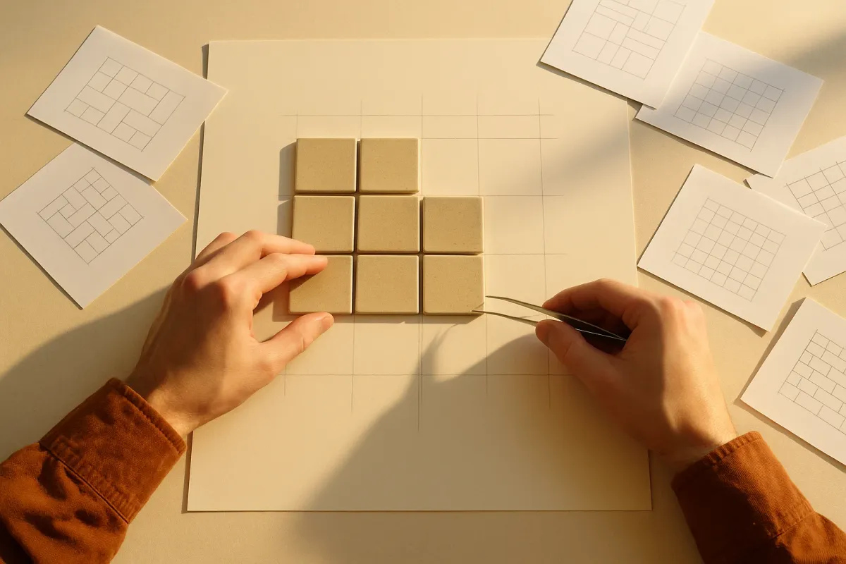
For a premium finish, treat grout width as a typographic designer treats kerning: deliberate, consistent, and responsive to proportion. Large-format porcelain with rectified edges can support a narrow, 1.5–2 mm (¹⁄₁₆") joint, but only if the substrate is impeccably flat and the tiles are caliber‑matched. Handmade zellige or terracotta, with inherent irregularities, demand a more generous joint that feels like a graceful pause rather than a nervous stutter. The goal is visual rhythm, not mathematical rigidity—tighter isn’t inherently more luxurious; correctness is. Ask your installer to dry-lay a test panel and stand back six to eight feet: the joints should read as even, controlled lines, not a jittery pattern calling attention to itself.
Layout as Sentence Structure: Avoiding “Accidental” Tile Punctuation
Those viral design fails are often caused not just by spacing, but by unfortunate breaks—where one word wraps at the wrong spot and creates an unintended meaning. Tile layouts can “mis-punctuate” a space in the same way. A poorly planned cut line across the middle of a niche, a sliver of tile beside a doorway, or a grout joint landing dead center behind a freestanding tub can visually interrupt the room like a comma in the wrong place.
Before a single tile is set, treat the room like a block of text and decide where your “line breaks” belong. In a shower, allow a full tile to center behind the shower column or main fixture, then work outward—accepting balanced cuts at outer corners rather than sacrificing the focal plane. On floors, align primary grout lines with architectural axes: the centerline of a corridor, the midpoint between two opposing openings, or the sightline from an entry to a key window. This is the difference between tile that merely covers surface area and tile that feels choreographed to the architecture. Ask for a scaled drawing or a full-size chalk layout on the slab; you’re editing syntax, not just ordering square footage.
Negative Space as a Luxury Material
The comedy in bad kerning often comes from a lack of breathing room: letters too close, words crashing into each other, or awkward gaps where nothing seems intentional. In interiors, negative space is the silent partner of every exquisite tiled surface. Luxury hotels and high-end retail understand this intuitively: stone and tile are allowed to breathe; there are pauses of clean wall, deliberate margins around fixtures, and quiet planes without visual noise.
When planning tile, resist the urge to cover every inch simply because you can. A tiled wainscot in a powder room that stops at a deliberate, well-proportioned height and leaves a calm expanse of painted wall above will always feel more tailored than full‑height tile crammed to the ceiling with no visual rest. Around a vanity, consider a “field of focus” behind the mirror—perhaps running tile just wider than the mirror and light fixtures, with crisp margins left to each side, much like white space around a magazine headline. In kitchens, allow a generous reveal between the edge of the upper cabinets and the end of the backsplash rather than running tile to a random corner. Negative space is not unused area; it’s what makes the tiled area read as precious.
Micro‑Alignment: When Millimeters Decide Whether It Looks Custom
The funniest examples in the viral spacing article aren’t always about massive mistakes; often, they’re about tiny misalignments that throw off the whole composition. A single letter sitting slightly higher than its neighbors makes an entire word feel amateurish. In tile, these micro-mistakes accumulate quickly: a niche not exactly aligned with a grout joint, an accent border that’s off by a few millimeters from the vanity edge, or a threshold that doesn’t line up with the flooring pattern beyond.
Luxury tile work is defined by a near-obsessive respect for alignment. Ask your installer to coordinate tile joints with visible architectural elements: the outside edge of a range hood, the center of a window mullion, the corner of a kitchen island. If you’re mixing materials—say, a porcelain floor meeting hardwood in an adjacent room—ensure the joint of one field relates intentionally to the pattern of the other. Even linear drains, those modern darlings of high-end showers, should be placed to coincide with grout lines rather than cutting across them arbitrarily. When in doubt, stand in the doorway and trace every visible line with your eye. Where lines converge or misalign is where a space either declares itself bespoke or betrays rushed decision-making.
Color, Contrast, and the “Readability” of Your Surfaces
The trending Bored Panda piece underscores how poor contrast and spacing make text difficult to read—or worse, unintentionally comic. In tiled environments, color and contrast determine not only aesthetic mood but also how legible and restful your surfaces feel. Overly busy patterns with high-contrast grout can make a room feel frenetic, just as all-caps text in a bold font and tight spacing can shout at the reader.
For a refined result, consider how you want your surfaces to “read” at a glance. If the tile itself is the statement—veined porcelain slabs, patterned encaustic, or rich marble—allow the grout to recede tonally, staying within a subtle shade or two of the base color. This mimics the quiet spacing of a beautifully typeset book, where you notice the content, not the gaps. Conversely, if grid and structure are part of your design language—as in a modern, Bauhaus-inspired space—a deliberate grout contrast can emphasize geometry the way a monospace typeface emphasizes each character. The key is intention: avoid accidental mid-tones where the grout half-fights the tile, and avoid mixing too many competing contrasts in a single sightline. Think of each wall or floor as a page; it should be instantly “readable” from the room’s primary approach.
Conclusion
The internet may be laughing at clumsy signage and mangled kerning today, but behind the humor lies a serious design lesson: spacing, alignment, and rhythm quietly determine whether something feels luxurious or careless. For homeowners investing in tile, these invisible decisions are where true refinement lives.
By treating grout lines as kerning, layouts as sentence structure, negative space as a material in its own right, micro‑alignments as non-negotiable, and color contrast as “readability,” you move beyond mere finishes into the realm of considered composition. In a world where design flaws go viral, there is a particular satisfaction in stepping into a room where every tile, every joint, every pause has been calibrated—silently communicating that here, nothing is accidental.