This guide explores how to think about tile color with the same precision a couturier applies to fabric. Rather than chasing trends, we’ll focus on enduring principles and five exclusive insights that help homeowners and designers make decisions that will still feel correct a decade from now.
The Architecture of Color: Treating Tile as a Structural Finish
Tile is not an accessory; it is a structural finish that alters how a room reads and behaves. When you approach tile color like architectural millwork rather than paint, your choices become more deliberate and more enduring.
Begin by defining the “temperature” of the room before you even look at samples. Do you want a space that feels sunlit even at night, or one that absorbs light and wraps you in calm? Warm stone tones, sand, and muted taupes tend to pull light forward and feel welcoming; cool greys, chalky whites, and deep inky blues recede, creating a quieter, more contemplative backdrop. Neither is inherently better—what matters is the emotional brief for the space.
Pay careful attention to how tile color interacts with fixed elements that are not easily changed: window frames, existing stone thresholds, metal finishes, and adjacent flooring. Think of tile as the bridge that must reconcile all of these. Often, the most successful palettes are those that lean into subtle, almost imperceptible undertones already present in the architecture—an off‑white that echoes the existing trim, or a warm grey that gently references the veining in a fireplace stone.
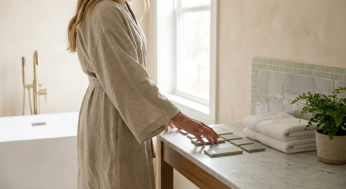
Light is the final architect of color. The same tile installed under north-facing light will read very differently under western sun or warm LEDs. Before committing, place full-size samples flat on the floor and vertically on the wall, and observe them morning, midday, and evening. The tile that looks flawless under showroom lighting may appear greenish or flat in your home; the one that seems understated under artificial light may glow beautifully at dawn.
Insight 1: Design with Undercurrents, Not Headlines
Refined tile color is rarely about the obvious hue; it is about the undercurrent—the whisper of secondary tone that reveals itself slowly. This undercurrent is what determines whether your “white” feels creamy, chalky, blue, or stone-like, and whether your “grey” lands as elegant or cold.
Rather than asking, “Do I like this color?” ask, “What is this color secretly doing?” Examine the undertone in relation to three anchors: your wall paint, your cabinetry or main furnishings, and your metal finishes. A warm “greige” tile with even a trace of red undertone can clash with cool brushed nickel, while a slightly green-grey can calm brass and walnut beautifully.
The most elevated interiors often choose tiles whose color undercurrents are deliberately quiet. These are shades that refuse to dominate the space but make everything placed near them look better—much like a perfectly tailored black dress that allows jewelry and skin tone to shine. Look for tiles that shift gently between neighboring tones rather than those with a single, hard note.
To evaluate this, avoid examining one tile in isolation. Place three or four candidate tiles beside each other and notice which feels harsh, which feels dull, and which feels convincingly “inevitable” in your room. Often, the tile that communicates luxury is the one that appears modest at first glance but becomes more interesting the longer you look at it.
Insight 2: Composed Contrast—Why Luxury Lives Between Light and Dark
High-end rooms rarely rely on extreme contrast (“bright white with near-black”) or complete absence of contrast (“everything the same beige”). Instead, they occupy a measured middle—what you might think of as composed contrast.
Begin with a baseline: select a primary tile tone that matches either your wall color family or your principal furnishing tone. Then introduce a secondary tile or grout color that sits two or three steps away on the light–dark scale, not eight. This creates visual structure without visual noise. For example, a warm off‑white wall, a light putty floor tile, and a medium warm-grey grout will read as layered and intentional, whereas white walls, very dark tiles, and bright white grout can feel visually frenetic.
In wet areas, such as showers, consider using contrast vertically rather than horizontally. A deeper tone on the floor that softens into a lighter tone on the walls can ground the space while still feeling serene. Conversely, a darker wall niche framed in a slightly lighter field tile can create a subtle architectural moment without resorting to bold accent colors.
This approach is especially powerful in open-plan homes. By keeping contrast ranges tight but consistent—say, always working within a three-step gradient—you achieve cohesion from room to room. The luxury is in the control: surfaces transition, but they do not compete.
Insight 3: Grout as a Design Instrument, Not an Afterthought
Grout color is often treated as a technical detail, but in sophisticated tile work, grout behaves much like the line in a drawing. It can dissolve, refine, or gently emphasize pattern and geometry.
If your aim is a monolithic, seamless look—particularly with large-format tiles—select a grout within a half shade of the tile’s primary tone. This allows the eye to read the surface as a continuous plane, which feels inherently more architectural and serene. This is especially effective in shower walls, entry floors, and large living areas where you want visual stillness.
When the tile has an intentional pattern—chevron, herringbone, or a small-format mosaic—consider a grout that is one or two shades deeper or lighter, but still within the same undertone family. This acknowledges the pattern without turning the surface into an optical effect. The line is there for those who look for it, but it doesn’t dominate the room.
Reserve strong grout contrast (like charcoal on white tile) for moments where you deliberately want to articulate rhythm, such as a kitchen backsplash with a simple stacked layout or floor tiles used to visually “stretch” a narrow corridor. Even then, scale matters: smaller tiles can handle more contrast; large tiles with bold grout lines can feel busy and reduce the sense of luxury.
The exclusive insight here is to test grout not only against a single tile, but against the full field of tiles and the room’s overall palette. A grout that looks elegant on a sample board might read as a grid from across the room. Tape small grout swatches on top of actual laid-out tiles and step back several meters; judge the effect from where you will actually inhabit the space.
Insight 4: Layering Texture in the Same Color Family
In elevated interiors, “color” is as much about texture as it is about hue. Using a single color family across multiple textures can create an almost couture-like depth—quiet but unmistakably intentional.
Consider pairing a matte floor tile with a soft-sheen wall tile of the same tone in a bathroom. Under low evening light, the wall will catch a subtle glow while the floor remains calm and non-reflective. In kitchens, a honed stone-look porcelain floor combined with a lightly glazed subway tile backsplash in nearly the same shade can produce a rich, layered effect without introducing a second color.
This is where tile finish becomes crucial: matte, honed, polished, and satin surfaces bounce and absorb light differently. When they share a color language, they create a sophisticated play of shadow and reflection. When they are mismatched in color, they can feel disjointed, as if elements were chosen in isolation.
A simple method: choose one core color—perhaps a warm limestone tone or a soft grey—and then express it in two or three finishes and formats. The floor might be a large-format matte tile, the shower walls a smaller satin tile, and the niche a subtle mosaic variation. The palette remains disciplined; the interest comes from light interacting with surfaces, not from competing colors.
The key is restraint. Limit the number of color families, but be generous with scale and texture variations inside that family. This is the difference between a room that feels intentional and one that feels “decorated.”
Insight 5: Designing for Patina—Color That Ages with Grace
The most intelligent tile palettes anticipate time: dirt, sunlight, minor scratches, and evolving furnishings. Luxury is not just how a space photographs when new, but how gracefully it supports daily life year after year.
Tiles in heavily used zones—entries, kitchens, family baths—benefit from colors that acknowledge reality. Mid-tone neutrals and stone-inspired shades tend to age more elegantly than extreme lights or darks. Very pale tiles show every speck; very dark surfaces reveal dust, water spots, and soap residue. A carefully chosen “middle” tone, with gentle movement or subtle variation, can visually absorb small imperfections and feel forgiving without ever reading as busy.
Think of patina as part of the design story rather than an inconvenience. Softly mottled tiles, delicate veining, or slight tonal variation from piece to piece can make a floor look more authentic over time. These details echo natural materials like limestone and terrazzo, where micro-variations are expected and admired.
Also consider the trajectory of your furnishings. If you enjoy changing textiles, art, or loose furniture, keep your tile palette quiet and neutral, with undertones that harmonize broadly (for instance, a neutral that works with both warm and cool metals). If your style is more fixed, you can lean slightly more specific—warmer tiles for classic woods and brass, cooler tiles for pale oak and blackened steel—but still stay within a timeless range.
An insider technique: request at least six to eight samples of the same tile and lay them out together. If the variation across pieces feels natural and coherent, that tile is likely to age beautifully. If some pieces feel unexpectedly harsh or out of tune, those anomalies will be more noticeable in a full installation over time.
Conclusion
Quietly luxurious tile design is not about spectacle; it is about discipline, nuance, and an almost obsessive attention to color behavior. When you design with undercurrents instead of headlines, control contrast rather than chase it, treat grout as an instrument, layer texture within a shared palette, and plan for patina, your tilework becomes more than a surface. It becomes the calm, enduring architecture of the room.
The most successful tile spaces feel inevitable—as though they could not have been done any other way. That sense of inevitability is crafted, not accidental. With a refined eye for color and a willingness to consider how your tiles will live with light, time, and daily life, you can create rooms that are not only beautiful now, but beautifully resilient for years to come.
Sources
- [Sherwin-Williams – The Science of Color](https://www.sherwin-williams.com/en-us/homeowners/color) – Explores undertones, light interaction, and how color is perceived in interiors
- [Benjamin Moore – Understanding Undertones](https://www.benjaminmoore.com/en-us/paint-and-color-inspiration/color-basics/undertones) – Detailed explanation of warm vs. cool undertones and how they affect design decisions
- [U.S. Department of Energy – Daylighting and Energy](https://www.energy.gov/energysaver/daylighting) – Discusses natural light in buildings and how orientation and glazing influence interior lighting
- [Ceramic Tile Education Foundation](https://www.ceramictilefoundation.org/) – Technical and best-practice guidance on tile selection, grout, and installation quality
- [Interiors + Sources – The Psychology of Color in Design](https://www.interiorsandsources.com/psychology-of-color-in-interior-design) – Overview of how color impacts mood and spatial perception in interior spaces